
Designing for AI Search
For years, the goal was simple:
Get people to your site.
Drive traffic.
Optimize for clicks.
That model is starting to break.
Tools like Google Search, ChatGPT, and Perplexity AI are answering questions before a user ever clicks.
No tabs.
No browsing.
No funnel.
Just an answer.
Which changes the role of a website entirely.
Because if the first interaction doesn’t happen on your site anymore,
then what exactly are we designing for?
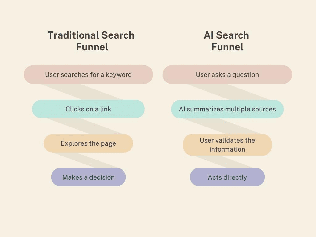
What’s breaking
Most websites are still built around a behavior that’s disappearing:
land on a page
scroll
explore
compare
But AI doesn’t behave like a user.
It scans.
Extracts.
Summarizes.
And most sites aren’t designed for any of that.
They rely on:
vague, brand-led headlines
long, unstructured paragraphs
answers buried halfway down the page
layouts that prioritize aesthetics over clarity
It looks polished.
But it’s not understandable — at least not quickly.
And speed of understanding is now everything.
The shift: from pages to answers
(image credit: percumedia)
This isn’t just an SEO change.
It’s a design shift.
We’re moving from:
Old | New |
|---|---|
Optimize for clicks | Optimize for answers |
Page-based UX | System-based UX |
Keywords | Intent + clarity |
Visual hierarchy | Semantic hierarchy |
AI doesn’t care how your page looks.
It cares whether your content can be turned into something usable:
a sentence
a list
a clear recommendation
That puts pressure on something designers haven’t always owned:
structure.
Where this shows up in real work
This shift becomes obvious the moment you work on something with real purchase friction — and actually see what happens beyond the screen.
Since acquiring a local countertop fabrication business, I’ve had a rare chance to see the full loop:
not just Google Analytics or heatmaps, but what customers are actually saying when they walk in or call.
And something interesting started coming up through our office manager.
People would mention things like:
“We found you through AI.”
“You guys popped up when I asked what countertops to choose.”
Not a search result. Not an ad.
An answer.
That was the moment it really clicked:
The way content is structured isn’t just affecting rankings anymore —
it’s determining whether you show up at all.most customers come in with one goal:
make a decision.
Not browse. Not explore. Decide.
And the questions they ask are incredibly direct:
“What’s better, quartz or quartzite?”
“What should I pick if I don’t want to maintain it?”
“What do most people choose?”
If that information lives on the site as:
“We offer a wide selection of premium surfaces…”
it doesn’t get surfaced.
It doesn’t help.
And increasingly, it doesn’t get seen.
But when it’s structured as:
Most homeowners choose quartz or quartzite because they’re durable and low maintenance.
That’s something AI can pull instantly.
It’s also something a user can understand without effort.
Same business. Same expertise.
Completely different visibility.
I’ve seen a similar pattern on the opposite end of the spectrum — in more discovery-driven work like the jewelry brand I work for, Banter.
When someone searches:
“What jewelry is trending right now?”
AI isn’t surfacing brand language.
It’s surfacing clarity:
chunky hoops
stacked piercings
mixed metals
If the experience starts with:
“Shop new arrivals”
you’re competing for attention.
If it’s structured around:
clearly defined trends
labeled categories
content that mirrors how people search
you become part of the answer — not just a destination after it.
What most sites are still optimizing for
A lot of digital design is still built around:
scrolling behavior
visual storytelling
immersive layouts
And those things still matter.
But there’s a new layer underneath it:
Can this be understood instantly?
Can this be extracted without context?
Because if it can’t, it won’t show up.
What I’d do differently
If I were designing today, especially for marketing sites, I’d shift a few priorities:
Headlines that answer, not tease
Clarity beats brand language. Every time.
Content that can be pulled apart
shorter sections
labeled groupings
bullet points where possible
Not just easier to read — easier to extract.
Systems over pages
Instead of designing one perfect page, design:
decision frameworks
comparison modules
FAQs
pricing breakdowns
Reusable structures that hold meaning on their own.
Answer first, brand second
Most sites lead with who they are.
But users — and AI — are looking for what’s true.
Brand becomes the byproduct of clarity, not the starting point.
So where does the website still matter?
If AI owns the first answer,
your site owns the final decision.
Users still visit — just later, and with more intent.
They’re not browsing anymore.
They’re confirming.
Which means your job shifts from:
getting attention
to:
removing doubt
As quickly as possible.
The uncomfortable part
Traffic might go down.
But traffic was never the real goal.
The brands that win in this shift won’t be the ones with the most visits.
They’ll be the ones that are:
easiest to understand
easiest to extract from
easiest to trust
Final thought
My most recent site iterations have made this shift very real for me.
When someone is about to spend thousands of dollars,
clarity isn’t a nice-to-have — it’s the product.
AI is just accelerating that reality.
It’s not killing websites.
It’s exposing which ones were never clear to begin with.
And pushing design in a direction that feels overdue:
Less decoration.
More structure.
More meaning.
More answers.