
The site is built on quiet confidence.
• Editorial pacing over dense layouts
• Human, minimal copy
• Image-led storytelling
• Calm hierarchy and generous white space
• A refreshing palette that nods to the hotel’s whimsical undertone
Scrolling should feel like stepping into the house — layered, warm, and thoughtfully paced.
Color Palette

Stay Here, Step Out
The neighborhood is treated as part of the stay. Reikhart House is positioned as a calm base within a walkable, character-rich area—encouraging guests to explore naturally and return when ready.

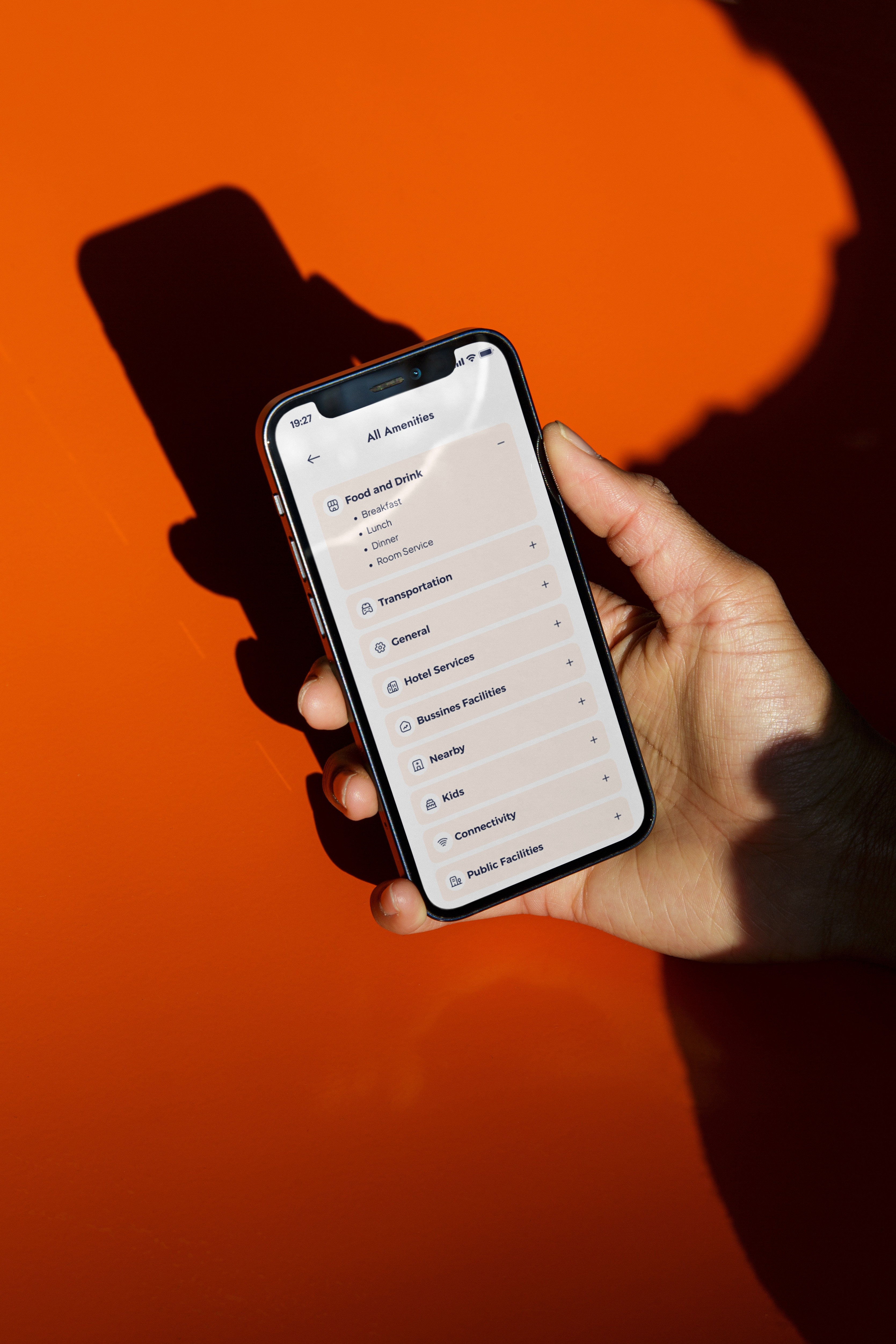
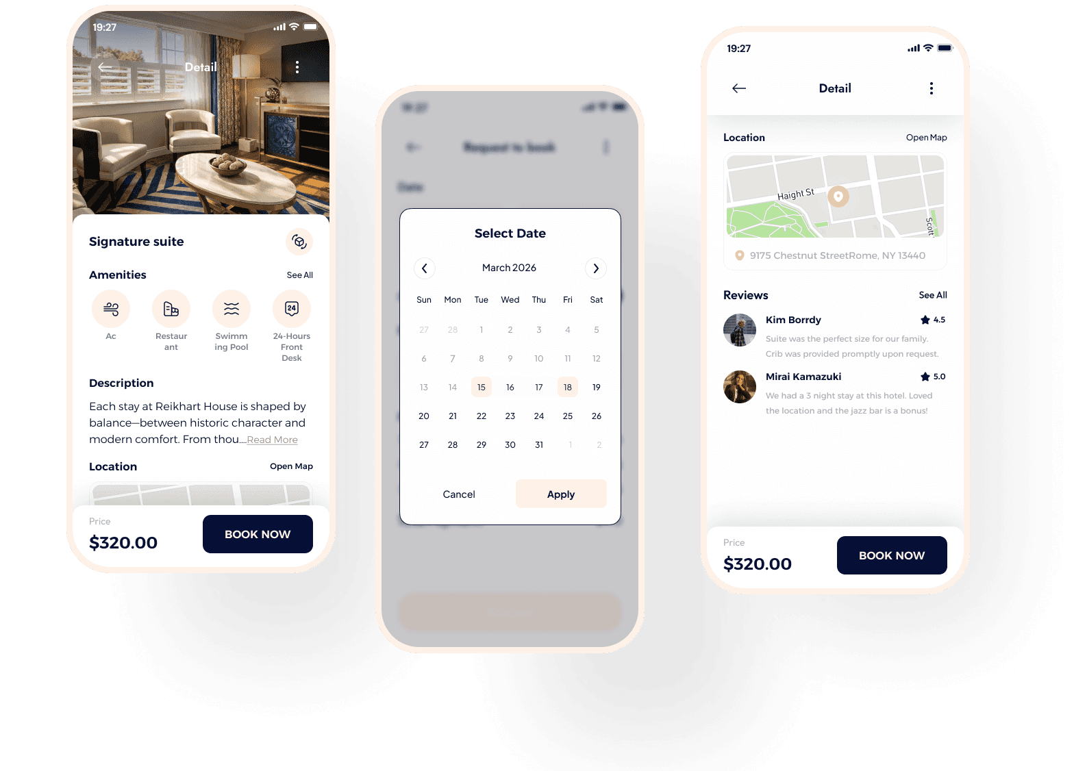
Accommodation experience
A structured tab layout reduces friction in the decision-making process, while refined visuals preserve brand continuity and mood.


A Cohesive
Expression
The final system brings together heritage, warmth, and subtle personality into a unified digital experience. Through considered hierarchy, restrained typography, and a refreshing color palette, the redesign translates brand character into structure — creating a presence that feels intentional, immersive, and distinctly its own.
You might also enjoy reading